Howdy, Stranger!
It looks like you're new here. If you want to get involved, click one of these buttons!
Quick Links
Categories
- 7.9K All Categories
- 12 Help with translations
- 4.3K General questions
- 107 Roadmap
- 360 Game & application design
- 322 Plugins
- 71 User experience
- 75 Marketplace
- 294 Code snippets
- 34 Building a team?
- 269 Suggestions & requests
- 354 Announce your apps made with Gideros.
- 91 Step by step tutorials
- 679 Bugs and issues
- 195 Introduce yourself
- 246 Announcements
- 107 Forum talk
- 405 Relax cafe
In this Discussion
Widget Candy for Gideros
Just a note to let you know that Widget Candy is available for Gideros SDK now 
Porting it to Gideros wasn't an easy task and required a good amount of work because we wanted it to look and feel *exactly* like the Corona version.

Widget Candy GUI Extension
Widget Candy is a most flexible yet easy to use GUI Lua library that allows you to easily add all kind of skinnable graphical user interfaces to your apps and games, all with a few lines of code. Widget Candy is available for a couple of years now and during that time, it was constantly enhanced to reflect user input and professional demands. There are already many Widget Candy powered apps and games available in the app stores.
Themes
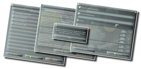
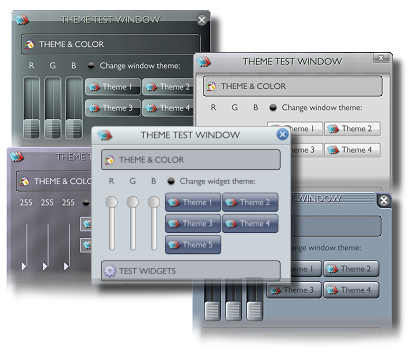
Widget Candy comes with many different themes (Android, iOS and others) -and you can easily create your own themes to give your app or game a unique look (templates included). Themes can be switched in realtime, so you can change the complete look of your app using a single command. Each theme requires a single texture only, so it makes not only efficient use of texture memory but also allows easy customization of any theme.
Automated Widget Layout
Widget Candy comes with a powerful, automated layout system to arrange your widgets automatically inside a window widget. There is no need to fiddle with widget coordinates, Widget Candy does this for you. Each widget's position, as well as it's width and height, can be set to percentage values (which are either referring to the screen size or a parent window's size). Additionally, automatic widget alignment allows you to use "left", "center" or "right" as a widget's x-position, for example to automatically place it on the left or right border of the screen (or a parent window) or to center it for you. You even don't need to specify any coords at all for your widgets, simply place them inside a window widget and let Widget Candy layout them automatically for you. Layouting an interface has never been easier!
Porting your Corona codes
Widget Candy for Gideros features the same API as the Corona version and we put a lot of work into it to feel, smell and taste *exactly* as the Corona version, so it allows you to port your existing widget codes to Gideros without any modifications and without any extra work. So if you migrated from Corona to Gideros, simply copy & paste your widget code into your Gideros project and you are ready to go.
INCLUDED WIDGETS

50% OFF COUPON
We set up a 50% off coupon code for Gideros users, by the way (please note that this is a time-limited offer and may be removed without further notice). Enter WIDGETSFORGIDEROS to activate the discount. Purchasers of any Candy library receive a personal bundle coupon code to obtain all other Candy libraries (also upcoming ones) half-off. So if you purchased any Candy library before, just enter your personal bundle coupon code to activate your discount.
More details, API & Reference
For screenshots, videos, details on how to use Widget Candy, as well as the complete API reference, please see Widget Candy website
Please let us know if you've got any questions, feedback or suggestions or drop us a line for support or if you'd like to report any issues: info -at- x-pressive.com
Porting it to Gideros wasn't an easy task and required a good amount of work because we wanted it to look and feel *exactly* like the Corona version.

Widget Candy GUI Extension
Widget Candy is a most flexible yet easy to use GUI Lua library that allows you to easily add all kind of skinnable graphical user interfaces to your apps and games, all with a few lines of code. Widget Candy is available for a couple of years now and during that time, it was constantly enhanced to reflect user input and professional demands. There are already many Widget Candy powered apps and games available in the app stores.
Themes
Widget Candy comes with many different themes (Android, iOS and others) -and you can easily create your own themes to give your app or game a unique look (templates included). Themes can be switched in realtime, so you can change the complete look of your app using a single command. Each theme requires a single texture only, so it makes not only efficient use of texture memory but also allows easy customization of any theme.
Automated Widget Layout
Widget Candy comes with a powerful, automated layout system to arrange your widgets automatically inside a window widget. There is no need to fiddle with widget coordinates, Widget Candy does this for you. Each widget's position, as well as it's width and height, can be set to percentage values (which are either referring to the screen size or a parent window's size). Additionally, automatic widget alignment allows you to use "left", "center" or "right" as a widget's x-position, for example to automatically place it on the left or right border of the screen (or a parent window) or to center it for you. You even don't need to specify any coords at all for your widgets, simply place them inside a window widget and let Widget Candy layout them automatically for you. Layouting an interface has never been easier!
Porting your Corona codes
Widget Candy for Gideros features the same API as the Corona version and we put a lot of work into it to feel, smell and taste *exactly* as the Corona version, so it allows you to port your existing widget codes to Gideros without any modifications and without any extra work. So if you migrated from Corona to Gideros, simply copy & paste your widget code into your Gideros project and you are ready to go.
INCLUDED WIDGETS
- Graphical buttons
- Toggle buttons
- Drag buttons
- Shape buttons of any size
- Progress bars
- Checkboxes
- Radiobuttons
- Scrolling lists
- Wrapped multiline texts
- Labels
- Switches
- Sliders
- Iconbars
- Draggable windows (hold and arrange widgets)
- Alert boxes
- Confirmation dialogs
- New: Calendar widget
- New: Scroll view
- New: Virtual keyboard
- and others (updated frequently)


50% OFF COUPON
We set up a 50% off coupon code for Gideros users, by the way (please note that this is a time-limited offer and may be removed without further notice). Enter WIDGETSFORGIDEROS to activate the discount. Purchasers of any Candy library receive a personal bundle coupon code to obtain all other Candy libraries (also upcoming ones) half-off. So if you purchased any Candy library before, just enter your personal bundle coupon code to activate your discount.
More details, API & Reference
For screenshots, videos, details on how to use Widget Candy, as well as the complete API reference, please see Widget Candy website
Please let us know if you've got any questions, feedback or suggestions or drop us a line for support or if you'd like to report any issues: info -at- x-pressive.com
Likes: ar2rsawseen, mehmetuysal, loucsam, vitalitymobile, gorkem, OZApps, bravcm
+1 -1 (+7 / -0 )Share on Facebook


Comments
Don't forget to add the Gideros image under the widget candy offering, on the web page you provided. Although it is shown once you click on the candy link.
Features request: + 1 for scroll view and slide view widget
https://deluxepixel.com
Have you(s) used the particle candy or this one in Corona before ?
Dislikes: kussakov
http://artleeapps.com/
Bubble Adventure - Colors
iPhone? https://itunes.apple.com/us/app/save-my-toys/id593292899?l=en&ls=1&mt=8
Andoid? https://play.google.com/store/apps/details?id=cat.acb.savemytoys
Added calendar widget to pick and display dates
See updated reference for details on how to use.
Likes: SinisterSoft, chipster123, vitalitymobile
https://deluxepixel.com
Here's another one -adds some visual improvements to the calendar and optional scroll indicator bars to the scroll view:
Likes: vitalitymobile
- New: Virtual keyboard. Supports any custom key layout, key sub menus, custom colors and UTF8 characters. Can be used with input texts (samples included). See added manual section 'Keyboard' and new sample codes.
- New: GUI.ShowTouches() - highlights all touch events when the user touches a widget or a window (visual touch feedback). You can define the size, as well as the color of the touch effect. See updated manual, 'Library Commands' for details.
- Various other improvements and new sample codes (display confirmation dialog on list item delete etc.)
Virtual KeyboardLikes: SinisterSoft
That seems really interesting. I know it's possible to create our own themes, but do you have plans to provide one or a few that seem a bit more "modern"?
Or isn't that in your plans at all?
And what is "modern"? Flat and monochrome? Or colorful and glossy?
But if you have a design in mind that you really like, just send us some screens or images and we'll add this as a new skin: support -at- x-pressive.com
Likes: bravcm
just curious, are you mocking my question? I did not ask for any specific design, certainly not adapted to my own app. Your interpretation was wrong.
There are some trends, among major platforms, some patterns that define UIs of this era. I am not one to define what is modern. You create UI, so I guess you are the experts.
I guess that was fair, as one of your clients, to ask if you have that kind of plans or not.
Likes: ar2rsawseen
Fragmenter - animated loop machine and IKONOMIKON - the memory game
It is hard to know what sort of design you are asking for, everyone has different tastes, and every app different needs and look. (No, you weren't being mocked at all.)
But I also think some, perhaps most, of the themes are a little bland/flat and I doubt I would use two thirds of them and that they need to be modernised a little. So, yes we need some more glossy, colourful, metallic, 3d looking, sci-fi, children's cartoony, etc themes, all of the above please
Maybe some clever person will write an app to customise and build the themes.
If they were able to provide a few themes in the first place, that means they had an idea of what would fit their customers at the time they created those themes. They never said "we won't provide any themes because it depends on your projects!". They found out what to provide. If their product is successful (and I believe it is) that's because they got it right.
My point is : if you look at their themes (or website) today, some people would say that they fit really well with the Amiga demoscene period. Which is not a bad thing (really).
I was interested to know if they are thinking about going through the process of figuring out what is an UI of our time or not? Like they did when they created their product.
Back to my question :
"do you have plans to provide one or a few that seem a bit more "modern"?
Answer : "we don't think our UI are outdated and we were not thinking about going through that process."
End of the discussion for me, I got my answer somehow.
As loucsam wrote: It is hard to know what sort of design you are asking for, everyone has different tastes, and every app different needs and look. That's why there is no "perfect all-purpose design", so I asked for your personal favourite. If you have one in mind, let us know (send us a screen from a game or an app that you like) and we'll include a theme that mimics that look.
As we included themes 1-3, for example, (wich have a decent 3d look) , people were asking for "flat", "serious" themes. Now we included flat themes and people are asking for colorful, 3d style themes again. That's what I was trying to explain. There is no GUI design that fits all tastes, so just let us know what you prefer and we'll include more themes.
Also note that the flat styled themes are intended to be used "fullscreen", in front of a monochrome background color (preferably black or white), so the Widget Candy demo doesn't show them off to their best advantage.
In my UI I use several ShapeButtons. I have 4 different menus, each of them contains up to 8 items such as buttons, checkboxes, etc. I initialize all of these menus on application startup because this process takes several seconds. On my Samsung Galaxy S4 it takes 2-3 seconds (it's acceptable value) but on HTC Desire C this process takes up to 7-8 seconds, it's extremly big value!
Moreover, I tried to animate these buttons by using GTween class and these animation also works slow, slowly than animations of same size PNG-images.
My question is: is it possible to generate all ShapeButtons only when application runs first time, then put them to the SD card and load as usual bitmap? Or may be exists some another way to improve Buttons generation and animation time?
Likes: hgvyas123
and learned plenty of lessons along the way!
I started out with predominantly "conventional" techniques, and added one or two Widget Candy widgets for particular tasks. As my project evolved I found myself more and more turning to particular WC widgets instead of the conventional techniques, as they are often easier and more configurable.
There is an occasional teething problem, as with any new product, but these were all involved with the programming side (understanding what WC is doing, with layers, for example)... no problems or unreliabilities apparent in production.
So many useful widgets, but my favourites are: ScrollView (lets you create a swipe able image gallery... had some problems including touch buttons within these images, but it is solvable); CustomListView (creates menu lists, scrollable, very configurable); Calendar (amazingly clever piece of kit allowing date selection popup). Of course, there is much more.
A couple of things that took me a little learning to get: Widgets are "named", and they remain until you kill them, even if you go to another scene using Scenemanager. You have to kill them when transitioning out of a scene otherwise you'll get a crash when you re-enter that scene (duplicate widget error). You don't have to assign them to a variable name... their own name (defined as a field within each widget) can be discovered and used to access each widget.
Also, you don't need to "addChild" to attach a widget to a layer... this is done simply within each widget by setting the "parentGroup" parameter.
There is certainly a learning curve with Widget Candy, and not a whole lot of tutorial info out there but it ain't rocket science and the benefits are worth the effort. THANKYOU to the clever people who wrote Widget Candy... it is a fabulous product and I look forward to future iterations.
(Suggestions for future additions to WC:
1) Pinch Zooming of images, and of ScrollViews.
2) Making including active elements (buttons) work in ScrollViews more easily.)
If you want to see what WE built with the help of Widget Candy, our "BreatheX breathing exercises" app is a free download:
Search "BreatheX" on the AppleStore or GooglePlay.
It seems like a conflict between the setTextColor method between the two of them.